How I Created Charts Using Charts.js in Django Web Application : Jonathan Okah
by: Jonathan Okah
blow post content copied from Be on the Right Side of Change
click here to view original post
If you want to display charts in your Django web application, whether it is a bar chart, a pie chart, or other charts, you have so many options at your disposal — from using Plotly in Python language to using HighCharts.js or Charts.js in JavaScript.
The beauty of using the later over the former is that all the heavy lifting has been done for us. By placing the link in your template, you can take advantage of all the available features. We have already demonstrated how to display charts using Highcharts.js in a Django web application.
In this tutorial, we will pay attention to Charts.js. Specifically, we will learn:
- Another way to populate the database other than the ones mentioned while learning how to do so with
Highcharts.js - How to query the database to display the data structured in such a way that
Charts.jscan understand. - How to display both bar chart and pie chart
The Model
For this project, we will use the data from Kaggle1 that shows the richest people in the world as of 2022. The data contains several columns but we are only interested in just a few of them. Let us create a database model for the dataset.
from django.db import models

GENDER = (
    ('M', 'Male'),
    ('F', 'Female'),
)

class Richest(models.Model):
    name = models.CharField(max_length=100)
    gender = models.CharField(max_length=1, choices=GENDER)
    net_worth = models.IntegerField()
    country = models.CharField(max_length=100)
    source = models.CharField(max_length=100)

    def __str__(self):
        return self.name
The model contains names of the richest people in the world, their net worth, country of origin and their source of wealth.
Populating the database
In the previous tutorial project on creating a chart using Highcharts.js, I showed you one of the ways to populate a database. I wrote a script from the Django shell to populate the database. In this tutorial, we will learn a different method.
We will use Django’s BaseCommand class to create a custom management command that populates the database using the dataset.
Start by creating new folders inside the app folder. For example, assuming the name of your Django app is charts and is created in your current directory, run the following in your Ubuntu terminal:
mkdir charts/management/commands -p
The p flag makes it possible to create a nested folder in one command. Inside the commands folder, create a new file named populate_db.py:
nano charts/management/commands/populate_db.py
let’s first import the required modules:
from django.core.management.base import BaseCommand
from charts.models import Richest
import csv
import math
BaseCommand is a class provided by Django that serves as the base class for writing custom management commands. Management commands are scripts that can be run from the command line to perform various tasks related to your Django app.
The BaseCommand class provides several useful methods and attributes that make it easy to write custom management commands. When you create a custom management command by subclassing BaseCommand, you need to override the handle method to define the behavior of your command.
The handle method is called when the command is executed, and it receives any command-line arguments passed to the command as keyword arguments.
In addition to the handle method, the BaseCommand class provides several other methods and attributes that you can use when writing custom management commands.
For example, as we shall see, you can use the add_arguments method to define custom command-line arguments for your command, and you can use the stdout and stderr attributes to write output to the Ubuntu terminal.
class Command(BaseCommand):
    help = 'Populate the database using a CSV file'

    def add_arguments(self, parser):
        parser.add_argument('forbes_2022_billionaires.csv', type=str, help='The path to the CSV file')

    def handle(self, *args, **options):
        csv_file = options['forbes_2022_billionaires.csv']

        with open(csv_file, 'r') as f:
            reader = csv.DictReader(f)
            for row in reader:
                skip_row = False
                for value in row.values():
                    try:
                        if math.isnan(float(value)):
                            skip_row = True
                            break
                    except ValueError:
                        pass
                if skip_row:
                    continue
                net_worth = int(float(row['finalWorth']))
                obj, created = Richest.objects.get_or_create(
                    name=row['personName'],
                    gender=row['gender'],
                    net_worth=net_worth,
                    country=row['countryOfCitizenship'],
                    source=row['source']
                 )

        self.stdout.write(self.style.SUCCESS('Successfully populated the database'))
We define a new Command class that inherits from BaseCommand.
In the add_arguments method, we define a new command-line argument called csv_file that specifies the path to the CSV file. In the handle method, we read the data from the CSV file and use a conditional statement to check if any of the values in the current row are NaN.
If any value is NaN, we use the continue statement to skip this row and move on to the next one. Otherwise, we use the get_or_create method to add the data to the database. Finally, we use the self.stdout.write method to print a success message.
We use a nested loop to iterate over each value in the row. For each value, we use a try-except block to try to convert the value to a float and check if it is NaN. If a ValueError exception occurs, we catch it and ignore it using the pass statement.
If any value in the row is NaN, we set the skip_row variable to True and use the break statement to exit the inner loop. After the inner loop completes, we use an if statement to check if the skip_row variable is True. If it is, we use the continue statement to skip this row and move on to the next one.
However, a problem arises from the dataset. The net_worth field is an IntegerField. Whereas, the data type of the finalWorth column is float. To avoid errors, we first convert the value of the net_worth field in the current row to a float using the float function, and then convert it to an integer using the int function. We then assign this integer value to the net_worth field of the Richest model instance using the get_or_create method.
Make sure you have the forbes_2022_billionaires.csv file downloaded and placed in your current directory. Then, run the command we defined from the command line using the manage.py script like this:
python3 manage.py populate_db forbes_2022_billionaires.csv
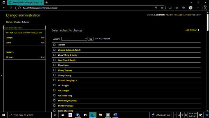
Afterward, a success message will be displayed. We have populated our database. Open the admin interface to see it.
Displaying charts using Charts.js
Make sure you have included the Charts.js library in your template by adding the following script tag to the <head> section of your HTML file:
<script src="https://cdn.jsdelivr.net/npm/chart.js"></script>
Next, add a <canvas> element to your template where you want to display the chart. Give this element an id so you can reference it in your JavaScript code.
Here’s an example:
<canvas id="myChart"></canvas>
In this demonstration, we will query the database to:
- Calculate total net worth of each country
- Get the top 10 richest people in the world
- Get the top 10 richest women in the world
- Get the distribution of wealth by gender
We will also include a pie chart. You can always check the source code for more details.
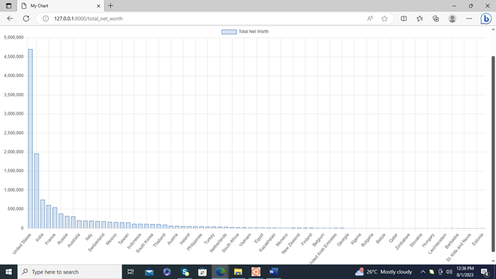
Displaying the total net worth of each country
from django.shortcuts import render
from django.db.models import Sum
from .models import Richest

def TotalNetWorth(request):
    # Query the database to get the data
    data = Richest.objects.values('country').annotate(total_net_worth=Sum('net_worth')).order_by('-total_net_worth')

    # Prepare the data for the chart
    chart_data = []
    for item in data:
        chart_data.append({
            'country': item['country'],
            'total_net_worth': item['total_net_worth']
        })

    # Render the template with the chart data
    return render(request, 'total_net_worth.html', {'chart_data': chart_data})
We group the data by country using the values method, and using the annotate method, we calculate the total net worth of each country.
Next, we prepare the data for the chart by creating a new list called chart_data and appending a dictionary for each item in the query result.
Each dictionary contains two keys: 'country' and 'total_net_worth', which represent the country and its total net worth, respectively.
<script>
    var ctx = document.getElementById('myChart').getContext('2d');
    var chart = new Chart(ctx, {
        type: 'bar',
        data: {
            labels: .map(item => item.country),
            datasets: [{
                label: 'Total Net Worth',
                data: .map(item => item.total_net_worth),
                backgroundColor: 'rgba(54, 162, 235, 0.2)',
                borderColor: 'rgba(54, 162, 235, 1)',
                borderWidth: 1
            }]
        },
        options: {
            scales: {
                y: {
                    beginAtZero: true
                }
            }
        }
    });
</script>
Here, we create a new Chart object and pass it the context of the <canvas> element and an options object that specifies the type of chart and its data.
We use the chart_data variable passed as context to populate the chart with data.
Then, we use the map method to extract the country names and total net worth values from the chart_data and assign them to the labels and data properties of the chart’s datasets.
Check out the source code for a demonstration of a pie chart. It’s almost the same.
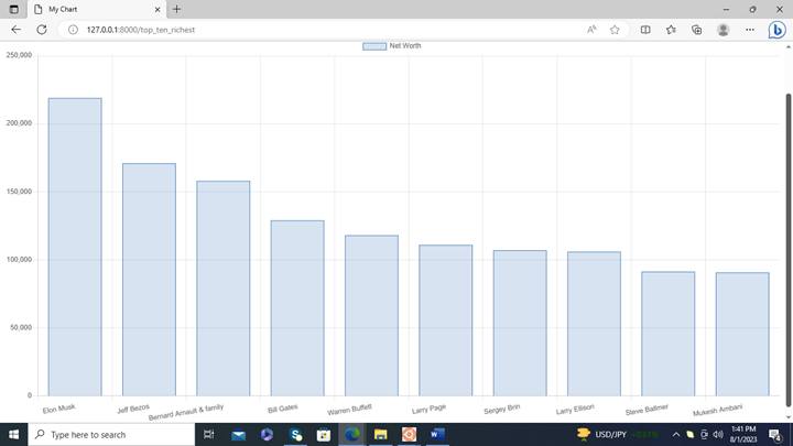
Displaying the top ten richest people in the world
def TopTenRichest(request):
    # Query the database to get the data
    data = Richest.objects.order_by('-net_worth')[:10]

    # Prepare the data for the chart
    chart_data = []
    for item in data:
        chart_data.append({
            'name': item.name,
            'net_worth': item.net_worth
        })

    # Render the template with the chart data
    return render(request, 'top_ten_richest.html', {'chart_data': chart_data})
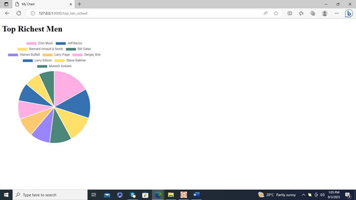
The following code shows how to display a pie chart using Charts.js:
var ctx = document.getElementById('myChart').getContext('2d');
var myChart = new Chart(ctx, {
    type: 'pie',
    data: {
        labels: .map(item => item.name),
        datasets: [{
            label: 'Net Worth',
            data: .map(item => item.net_worth),
            backgroundColor: [
                'rgb(255, 99, 132)',
                'rgb(54, 162, 235)',
                'rgb(255, 205, 86)',
                'rgb(75, 192, 192)',
                'rgb(153, 102, 255)',
                'rgb(255, 159, 64)',
                'rgb(255, 99, 132)',
                'rgb(54, 162, 235)',
                'rgb(255, 205, 86)',
                'rgb(75, 192, 192)'
            ],
            hoverOffset: 4
        }]
    },
    options: {
        title: {
            display: true,
            text: 'Top Ten Richest People'
        }
    }
});
This code creates a new Chart object and sets its type to 'pie'. The data for the chart is taken from the chart_data variable that was passed to the template from TopTenRichest view function.
The labels for the chart are set to the names of the richest people, and the data for the chart is set to their net worths.
The source code also contains the bar chart example.
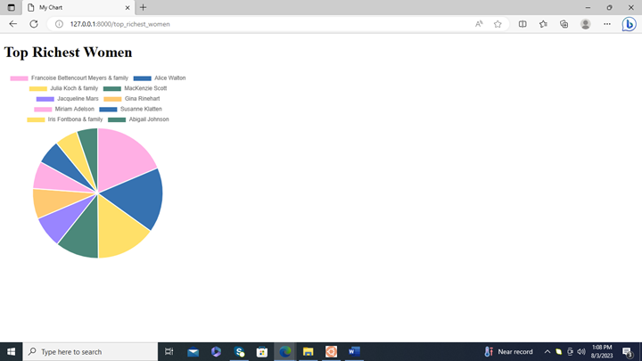
Displaying the top ten richest women
def TopRichestWomen(request):
    data = Richest.objects.filter(gender='F').order_by('-net_worth')[:10]
    names = [item.name for item in data]
    net_worths = [item.net_worth for item in data]
    return render(request, 'top_richest_women.html', {
        'names': names,
        'net_worths': net_worths
    })
Distribution of wealth by gender
def WealthByGender(request):
    # Query the database to get the total net worth for each gender
    male_net_worth = Richest.objects.filter(gender='M').aggregate(Sum('net_worth'))['net_worth__sum']
    female_net_worth = Richest.objects.filter(gender='F').aggregate(Sum('net_worth'))['net_worth__sum']

    # Prepare the data for the chart
    data = {
        'labels': ['Male', 'Female'],
        'datasets': [{
            'data': [male_net_worth, female_net_worth],
            'backgroundColor': ['#36A2EB', '#FF6384']
        }]
    }

    # Render the chart using the Chart.js library
    return render(request, 'wealth_by_gender.html', {'data': data})
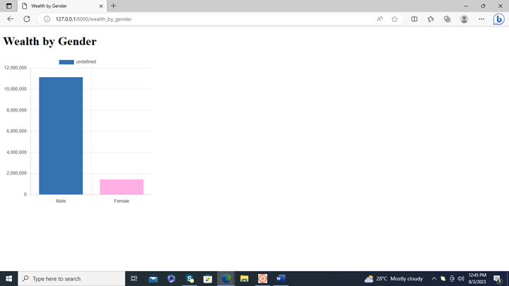
And this is the pie chart. Check the source code for more details:
Conclusion
In this project tutorial, we have learned various ways to query our database, structure the data and displayed them using charts.js, a JavaScript library for data visualization. We saw how Django interacts with charts.js to display charts on a template.
We also learned another way to populate the database by using Django’s BaseCommand class. Due to the nature of the dataset, we were restricted to only bar and pie charts. However, we can apply the process to create other charts.
Use the knowledge you learned to integrate charts in your Django web application.

 Recommended: The Math of Becoming a Millionaire in 13 Years
August 04, 2023 at 08:07PM
Click here for more details...
=============================
The original post is available in Be on the Right Side of Change by Jonathan Okah
this post has been published as it is through automation. Automation script brings all the top bloggers post under a single umbrella.
The purpose of this blog, Follow the top Salesforce bloggers and collect all blogs in a single place through automation.
============================


Post a Comment