How I Visualized Daily Temperature Over 50 Years in Your Home Town : Elena Konradi
by: Elena Konradi
blow post content copied from Be on the Right Side of Change
click here to view original post
In recent years we have heard so much that the climate is changing. The temperature is rising, and the ice is melting. You may wonder how much it has changed in the place you grew up. How much has it changed where you currently live?
So, I had an idea to create simple visualizations in Python to be able to see the temperatures of the past.
I want to choose a location and a month of the year. Then the application should get the Highest Daily Temperatures for the last 50 years. After that, it should display this data in various charts.
Here are the steps I need to achieve:
- Step 1: Find an API that would provide temperature historical data.
- Step 2: Write an application to retrieve this historical data.
- Step 3: Display data in charts. I will use bubble charts, heatmap, and line charts.
Here the journey starts…
Step 1: API to get Temperature historical data.
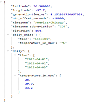
I found that the open-meteo.com website provides free weather APIs. I can get Daily Max Temperature with the link like this:
https://archive-api.open-meteo.com/v1/archive?latitude=30.27&longitude=-97.74&start_date=2023-04-01&end_date=2023-04-03&daily=temperature_2m_max&timezone=America%2FChicago I will need to provide location latitude and longitude, start and end dates, and a time zone. The response comes in JSON format and looks like this:
Now that I know the API to use and the format of data it returns, I can proceed with the application.
Step 2: Get Temperature Historical Data
I need to write two functions.
- The first one calls an API to retrieve data for one month for a given year.
- The second one loops over the last 50 years and call the first function.
I cannot do it in one API call because I need data only for one month per year, I do not want data for another 11 months. This would be too much unnecessary data, and it would take a long time for an API to return the result.
Here is the function that calls an API to get data for one month of one year:
import requests


def get_historical_weather(latitude, longitude, start_date, end_date, timezone):
    url = "https://archive-api.open-meteo.com/v1/archive?latitude=" + latitude + \
          "&longitude=" + longitude + "&start_date=" + start_date + "&end_date=" + \
          end_date + "&daily=temperature_2m_max,precipitation_sum&timezone=" + \
          timezone + "&temperature_unit=celsius"

    r = requests.get(url)
    response_dict = r.json() if r.status_code == 200 else None

    if not response_dict:
        print("No results returned from API")
        return

    return response_dict
Line 1. Import the packages that I will need.
Line 4. The function accepts the parameters needed for the API call. Their values can vary depending on the Location and Month a user wants to get the charts for.
Lines 10-11. This is where I call the API and get the response in JSON. There is also a check that the call was successful (status code =200).
Lines 13-17. If the call to API was not successful, I print a message. Otherwise, I can return the retrieved data.
The second function loops over fifty previous years.
It calls get_historical_weather() function to get data for each year. It saves data returned from the API in one list. It does not change the structure of the data. It only saves it.
I will need to format this data later to supply it for the charts. I save this data because I want to get it once, and then draw all charts. I do not want to call APIs for every chart I draw.
import datetime
import calendar


def get_all_historical_data(selected_month, latitude, longitude, timezone):
    historical_data = []

    for minus_years in range(50):
        year_graph = datetime.datetime.now().year - 1 - minus_years
        start_date = str(year_graph) + "-" + str(selected_month).rjust(2, '0') + "-01"
        end_date = str(year_graph) + "-" + str(selected_month).rjust(2, '0') + "-" + \
                   str(calendar.monthrange(year_graph, selected_month)[1])

        response_dict = get_historical_weather(latitude, longitude, start_date, end_date,
                                               timezone)

        if not response_dict:
            continue

        historical_data.append(dict(
            year=year_graph,
            daily=response_dict["daily"],
        ))

    return historical_data
Lines 1-2. Import packages.
Line 5. The function has parameters that represent the location and month of a user’s choice.
Line 6. Initialize the list that will hold all historical data.
Line 8. Loop over fifty previous years.
Lines 9-12. Get the year, start, and end date for a period (a month) to select data.
Line 14. Call the first function that I created earlier to get data for a specific month and a year.
Lines 17-18. If I do not get a response, I cannot do anything.
Lines 20-23. Save data in a list that keeps all historical data for all 50 years.
Line 25. Return a list with all data for 50 years. This is the data I will use for the charts.
Now I will create code that calls these functions when I run the application. I want to set the coordinates (latitude and longitude) of the Location and the Month I want to see data.
I will look at the January data for Chicago and the North Pole. I can print out data received from the API for a sanity check.
def main():

    # North Pole
    latitude = "90.00"
    longitude = "-135.00"
    timezone = "America%2FChicago"

    selected_month = 1

    historical_data = get_all_historical_data(selected_month, latitude, longitude, timezone)
    print(historical_data)

    return


main()
Line 1. Define the main function that runs when the application starts.
Lines 3-8. Set the Location, Month, and time zone. I put the values for the North Pole.
Line 10. Get all historical data for the selected Location and Month.
Line 11. Print data for a sanity check.
Line 16. Call the main() function on the application start.
Step 3: Visualize Data in Charts
I do not know what data for 50 years will look like. So, I will use three types of charts: bubble charts, heatmaps, and line charts.
Create Bubble Chart.
I start with the Bubble Chart. I want to display the Highest Daily Temperature for each day of the Selected Month for 50 years.
I want each bubble to be a distinct color depending on the temperature. I also want every bubble to be a distinct size depending on the temperature as well.
The bigger size will correspond to a higher temperature.
To draw the Bubble Chart, I need data organized into three lists.
- The first list contains the x coordinate for each bubble.
- The second list contains the y coordinate of each bubble.
- The third list contains temperature data for each bubble to display on the chart.
I will also create another list to hold hover text for each bubble on the chart.
Here are the functions that do this:
def init_graph_data():
    graph_data = {
        "days_month": [],
        "years": [],
        "high_temps": [],
        "hover_text": []
    }
    return graph_data


def prepare_data_bubble_chart(historical_data):
    graph_data = init_graph_data()

    for i in range(len(historical_data)):
        year_graph = historical_data[i]["year"]

        for j in range(len(historical_data[i]["daily"]["time"])):
            graph_data["days_month"].append(historical_data[i]["daily"]["time"][j][-2:])
            graph_data["high_temps"].append(historical_data[i]["daily"]["temperature_2m_max"][j])
            graph_data["years"].append(year_graph)
            graph_data["hover_text"].append(str(historical_data[i]["daily"]["time"][j]) + "<br>" +
                                            str(historical_data[i]["daily"]["temperature_2m_max"][j]) + " C")

    return graph_data
Lines 1-8. Initialize the dictionary that will hold the lists with data for the chart.
Line 11. The function gets all historical data as a parameter.
Lines 14 -24. The code loops through all historical data and saves it in the dictionary created on line 12. Then it returns this data that the chart can use.
Next, I create the function that draws the Bubble chart. I use the Python package plotly.graph_objects.
import plotly.graph_objects as go


def draw_bubble_chart(historical_data, selected_month, latitude, longitude):
    graph_data = prepare_data_bubble_chart(historical_data)

    marker_size_adjust = [day_temp - min(graph_data["high_temps"]) + 4 for day_temp in graph_data["high_temps"]]

    fig = go.Figure(data=go.Scatter(
        x=graph_data["days_month"],
        y=graph_data["years"],
        mode="markers",
        marker=dict(size=marker_size_adjust,
                    sizemode="area",
                    sizeref=2. * (max(graph_data["high_temps"]) - min(graph_data["high_temps"])) / (20. ** 2),
                    sizemin=4,
                    color=graph_data["high_temps"],
                    colorscale="Rainbow",
                    showscale=True,
                    cmax=40 if max(graph_data["high_temps"]) < 40 else max(graph_data["high_temps"]),
                    cmin=-30 if min(graph_data["high_temps"]) > -30 else min(graph_data["high_temps"])),
        hovertext=graph_data["hover_text"],
        hoverinfo="text"
    ))

    fig.update_layout(
        xaxis=dict(
            title='Day of the month'
        ),
        yaxis=dict(
            title='Years'
        ),
        title=dict(
            text="<b>Daily highest temperatures for " + calendar.month_name[selected_month] +
                 " over the last 50 years<br>" + "Location latitude: " + latitude + ", longitude: " + longitude +
                 "</b><br>",
            font_size=18
        )
    )

    fig.show()

    return
Line 1. Import the package.
Line 4. Define the function to draw the Bubble chart.
Line 5. Get the data in the correct format for the chart.
Line 7. Adjust the size of the marker so that the higher temperature markers are bigger.
Lines 9-41. Draw the chart: 
- Lines 10-11. Data displayed along axis x and y.
- Line 12. Mode of the chart – I want markers.
- Line 13. Set the size of the marker.
- Line 14-16. Size gets adjusted based on the available area.
- Line 17. The color of the markers gets set based on this data.
- Line 18-19. Sets color scale.
- Line 20-21. Sets min and max values of the color scale.
- Line 22-23. Sets hover text for markers.
- Line 26-39. Sets labels for the x and y axes and the chart title.
- Line 41. Opens a new tab in the browser with the chart.
Then I add the call to this function inside the main() function and run the program.
   --snip --
    selected_month = 1

    historical_data = get_all_historical_data(selected_month, latitude, longitude, timezone)
    draw_bubble_chart(historical_data, selected_month, latitude, longitude)

    return
Here is what I got for CHICAGO for JANUARY:

This is for the NORTH POLE for JANUARY:
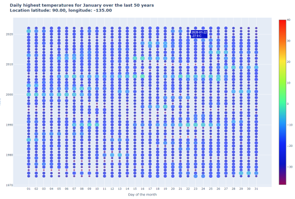
You can see the highest temperature of any day of January in the past 50 years. Bigger markers represent Higher temperatures. Also, the color pattern shows the changes in the temperature.
Create Heatmap Chart.
Next, I am going to create a heatmap.
It should give me a similar picture. But it should be easier to see the pattern. I need to reformat data returned by the API calls for displaying on the heatmap chart.
I will need three lists.
- The first list contains data for the x-axis.
- The second list contains data for the y-axis.
- The third list contains temperature data to display on the chart.
def prepare_data_heatmap_chart(historical_data):
    graph_data = init_graph_data()

    for i in range(len(historical_data[0]["daily"]["time"])):
        graph_data["days_month"].append(historical_data[0]["daily"]["time"][i][-2:])

    for i in range(len(historical_data)):
        year_graph = historical_data[i]["year"]
        graph_data["years"].append(year_graph)

        high_temps_year = list()
        for j in range(len(historical_data[i]["daily"]["time"])):
            high_temps_year.append(historical_data[i]["daily"]["temperature_2m_max"][j])

        graph_data["high_temps"].append(high_temps_year)

    return graph_data
Line 2. Initialize the dictionary to save formatted data.
Lines 4-5. Get data for the x-axis (days of the month).
Line 7. Loop through all historical data.
Lines 8-9. Get data for the y-axis (years)
Lines 11-15. Get data to display on the heatmap chart.
Line 17. Return formatted data for the chart.
 Recommended: How to make Heatmap using Pandas DataFrame?
Now I can draw the heatmap chart. I use plotly.express. So I need to import it.
import plotly.express as px


def draw_heatmap_chart(historical_data, selected_month, latitude, longitude):
    graph_data = prepare_data_heatmap_chart(historical_data)

    fig = px.imshow(img=graph_data["high_temps"],
                    labels=dict(x="Day of the month", y="Years", color="Temperature, C"),
                    x=graph_data["days_month"],
                    y=graph_data["years"],
                    aspect="auto",
                    color_continuous_scale="Rainbow",
                    title="<b>Daily highest temperatures for " +
                          calendar.month_name[selected_month] +
                          " over the last 50 years<br>" + "Location latitude: " +
                          latitude + ", longitude: " +
                          longitude + "</b><br></b><br></b><br>",
                    zmax=40,
                    zmin=-30,
                    origin="lower"
                    )

    fig.show()

    return
Line 1. Import the package.
Line 5. Get data in the correct format for the chart.
Line 7. Set data to display on the chart.
Line 8. Set text for the x label, y label, and color scale.
Lines 9-10. Set data displayed along the x and y-axis.
Line 13. Set the title of the chart.
Lines 18-19. Set the max and min temperature on the scale.
Line 20. Changes direction of the chart to have more recent years on top.
Line 23. Draw the chart on the new tab in the browser.
Then I add the call to this function inside the main() function and run the program.
-- snip --
    selected_month = 1

    historical_data = get_all_historical_data(selected_month, latitude, longitude, timezone)
    draw_bubble_chart(historical_data, selected_month, latitude, longitude)
    draw_heatmap_chart(historical_data, selected_month, latitude, longitude)

    return
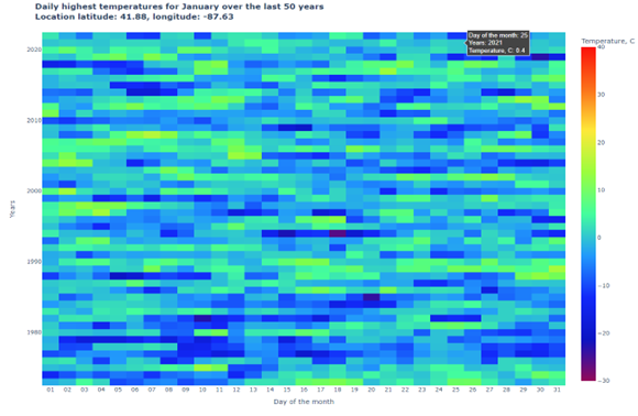
Here is what I got for CHICAGO for JANUARY:
This is for the NORTH POLE for JANUARY:
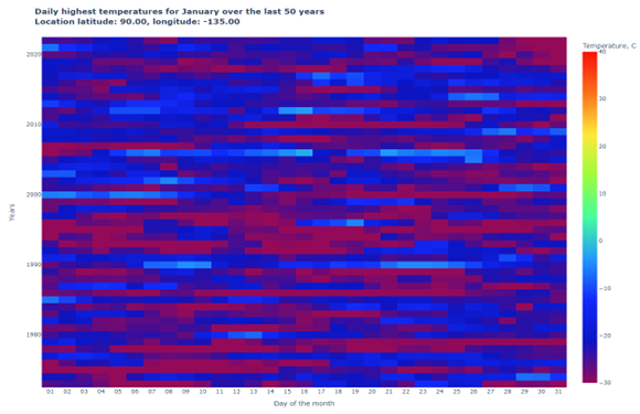
You can see the temperature for any day of January for the last 50 years. You can see from the color pattern what years were the coldest. Also, the last years were a little bit warmer.
Create Line Chart
The last chart I am going to try is the Line Chart.
It is the simplest. It should be easier to see the temperature changes. This chart will show the Highest Temperature per month for each year. It will also show an Average of the Highest Day Temperatures per month for each year.
First, I get data in the right format for displaying on the chart (like for the first two charts):
def prepare_data_line_plot(historical_data):
    graph_data = {
        "years": [],
        "high_temps": [],
        "average_temps": []
    }

    for i in range(len(historical_data)):
        year_graph = historical_data[i]["year"]
        graph_data["years"].append(year_graph)

        high_temps_year = list()
        for j in range(len(historical_data[i]["daily"]["time"])):
            high_temps_year.append(historical_data[i]["daily"]["temperature_2m_max"][j])

        graph_data["high_temps"].append(max(high_temps_year))
        graph_data["average_temps"].append(sum(high_temps_year) / len(high_temps_year))

    return graph_data
Lines 2-5. Initialize the dictionary to hold the data in the correct format.
Line 8. Loop through all historical data.
Lines 9-10. Populate data for the x-axis (years).
Lines 12-17. Get the Highest and Average temperatures to display on the chart.
Next, I will display the Line Chart:
def draw_line_plot(historical_data, selected_month, latitude, longitude):
    graph_data = prepare_data_line_plot(historical_data)

    fig = go.Figure()
    # Create and style traces
    color_name = "firebrick" if max(list(graph_data["high_temps"])) > 0 else "royalblue"
    fig.add_trace(go.Scatter(x=graph_data["years"], y=graph_data["high_temps"],
                             name="Highest Temp, C", mode='lines+markers',
                             line=dict(color=color_name, width=2)))
    color_name = "firebrick" if max(list(graph_data["average_temps"])) > 0 else "royalblue"
    fig.add_trace(go.Scatter(x=graph_data["years"], y=graph_data["average_temps"],
                             mode='lines+markers', name="Average of the Highest Day Temp, C",
                             line=dict(color=color_name, width=2, dash="dash")))

    # Edit the layout
    fig.update_layout(title='<b>Highest Day Temperature and Average of the Highest Day '
                            'Temperatures for ' +
                            calendar.month_name[selected_month] + " over the last 50 years<br>"
                            + "Location latitude: "
                            + latitude + ", longitude: " + longitude + "</b><br>",
                      xaxis_title="Year",
                      yaxis_title="Temperature (degrees C)")

    fig.update_layout(hovermode='x unified')

    fig.show()

    return
Line 2. Get data in the correct format.
Line 4. Create an empty chart to populate with data next.
Lines 6-9. Add the Line graph for the Highest Temperatures per month per year. The color schema should change from red to blue when all data is below 0 C.
Lines 10-13. Add the Line graph for Average Highest Daily Temperatures per month per year. The color schema should change from red to blue when all data is below 0 C.
Lines 16-24. Adjust the layout to display the chart title, labels along the axis, and hover information.
Line 26. Display the chart in the new browser tab.
Finally, I add the call to this function inside the main() function and run the program.
–snip –
    selected_month = 1

    historical_data = get_all_historical_data(selected_month, latitude, longitude, timezone)
    draw_bubble_chart(historical_data, selected_month, latitude, longitude)
    draw_heatmap_chart(historical_data, selected_month, latitude, longitude)
    draw_line_plot(historical_data, selected_month, latitude, longitude)

    return
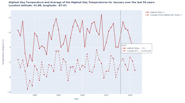
Here is what I got for CHICAGO for JANUARY:
This is for the NORTH POLE for JANUARY:
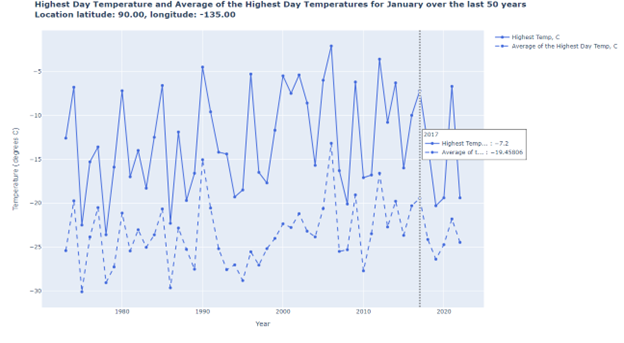
It is easier to see the changes from year to year on this graph. The trend of global warming is not obvious. But you can get an idea of what years were the warmest or coldest in January.
 Final Words: In this project, I got to work with data from JSON API. I explored creating different visualization charts in Python.
I used free APIs to get the temperature data. Then I used this data to display it on Bubble Chart, Heatmap, and Line Chart.
The first two charts were good for seeing the patterns of the temperature over the years. I could also check what temperature was on any day in the past 50 years.
The last chart was good to see the changes from year to year. I hope you find this interesting.
May 24, 2023 at 05:19PM
Click here for more details...
=============================
The original post is available in Be on the Right Side of Change by Elena Konradi
this post has been published as it is through automation. Automation script brings all the top bloggers post under a single umbrella.
The purpose of this blog, Follow the top Salesforce bloggers and collect all blogs in a single place through automation.
============================


Post a Comment