Visualizing Data in Python With Seaborn :
by:
blow post content copied from Real Python
click here to view original post
If you have some experience using Python for data analysis, chances are you’ve produced some data plots to explain your analysis to other people. Most likely you’ll have used a library such as Matplotlib to produce these. If you want to take your statistical visualizations to the next level, you should master the Python seaborn library to produce impressive statistical analysis plots that will display your data.
In this tutorial, you’ll learn how to:
- Make an informed judgment as to whether or not seaborn meets your data visualization needs
- Understand the principles of seaborn’s classic Python functional interface
- Understand the principles of seaborn’s more contemporary Python objects interface
- Create Python plots using seaborn’s functions
- Create Python plots using seaborn’s objects
Before you start, you should familiarize yourself with the Jupyter Notebook data analysis tool available in JupyterLab. Although you can follow along with this seaborn tutorial using your favorite Python environment, Jupyter Notebook is preferred. You might also like to learn how a pandas DataFrame stores its data. Knowing the difference between a pandas DataFrame and Series will also prove useful.
So now it’s time for you to dive right in and learn how to use seaborn to produce your Python plots.
Free Bonus: Click here to download the free code that you can experiment with in Python seaborn.
Getting Started With Python seaborn
Before you use seaborn, you must install it. Open a Jupyter Notebook and type !python -m pip install seaborn into a new code cell. When you run the cell, seaborn will install. If you’re working at the command line, use the same command, only without the exclamation point (!). Once seaborn is installed, Matplotlib, pandas, and NumPy will also be available. This is handy because sometimes you need them to enhance your Python seaborn plots.
Before you can create a plot, you do, of course, need data. Later, you’ll create several plots using different publicly available datasets containing real-world data. To begin with, you’ll work with some sample data provided for you by the creators of seaborn. More specifically, you’ll work with their tips dataset. This dataset contains data about each tip that a particular restaurant waiter received over a few months.
Creating a Bar Plot With seaborn
Suppose you wanted to see a bar plot showing the average amount of tips received by the waiter each day. You could write some Python seaborn code to do this:
In [1]: import matplotlib.pyplot as plt
   ...: import seaborn as sns
   ...:
   ...: tips = sns.load_dataset("tips")
   ...:
   ...: (
   ...:     sns.barplot(
   ...:         data=tips, x="day", y="tip",
   ...:         estimator="mean", errorbar=None,
   ...:     )
   ...:     .set(title="Daily Tips ($)")
   ...: )
   ...:
   ...: plt.show()
First, you import seaborn into your Python code. By convention, you import it as sns. Although you can use any alias you like, sns is a nod to the fictional character the library was named after.
To work with data in seaborn, you usually load it into a pandas DataFrame, although other data structures can also be used. The usual way of loading data is to use the pandas read_csv() function to read data from a file on disk. You’ll see how to do this later.
To begin with, because you’re working with one of the seaborn sample datasets, seaborn allows you online access to these using its load_dataset() function. You can see a list of the freely available files on their GitHub repository. To obtain the one you want, all you need to do is pass load_dataset() a string telling it the name of the file containing the dataset you’re interested in, and it’ll be loaded into a pandas DataFrame for you to use.
The actual bar plot is created using seaborn’s barplot() function. You’ll learn more about the different plotting functions later, but for now, you’ve specified data=tips as the DataFrame you wish to use and also told the function to plot the day and tip columns from it. These contain the day the tip was received and the tip amount, respectively.
The important point you should notice here is that the seaborn barplot() function, like all seaborn plotting functions, can understand pandas DataFrames instinctively. To specify a column of data for them to use, you pass its column name as a string. There’s no need to write pandas code to identify each Series to be plotted.
The estimator="mean" parameter tells seaborn to plot the mean y values for each category of x. This means your plot will show the average tip for each day. You can quickly customize this to instead use common statistical functions such as sum, max, min, and median, but estimator="mean" is the default. The plot will also show error bars by default. By setting errorbar=None, you can suppress them.
The barplot() function will produce a plot using the parameters you pass to it, and it’ll label each axis using the column name of the data that you want to see. Once barplot() is finished, it returns a matplotlib Axes object containing the plot. To give the plot a title, you need to call the Axes object’s .set() method and pass it the title you want. Notice that this was all done from within seaborn directly, and not Matplotlib.
Note: You may be wondering why the barplot() function is encapsulated within a pair of parentheses (...). This is a coding style often used in seaborn code because it frequently uses method chaining. These extra brackets allow you to horizontally align method calls, starting each with its dot notation. Alternatively, you could use the backslash (\) for line continuation, although that is discouraged.
If you take another look at the code, the alignment of .set() is only possible because of these extra encasing brackets. You’ll see this coding style used throughout this tutorial, as well as when you read the seaborn documentation.
In some environments like IPython and PyCharm, you may need to use Matplotlib’s show() function to display your plot, meaning you must import Matplotlib into Python as well. If you’re using a Jupyter notebook, then using plt.show() isn’t necessary, but using it removes some unwanted text above your plot. Placing a semicolon (;) at the end of barplot() will also do this for you.
When you run the code, the resulting plot will look like this:
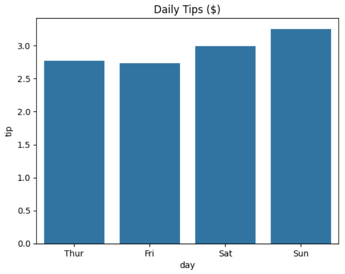
As you can see, the waiter’s daily average tips rise slightly on the weekends. It looks as though people tip more when they’re relaxed.
Note: One thing you should be aware of is that load_dataset(), unlike read_csv(), will automatically convert string columns into the pandas Categorical data type for you. You use this where your data contains a limited, fixed number of possible values. In this case, the day column of data will be treated as a Categorical data type containing the days of the week. You can see this by using tips["day"] to view the column:
In [2]: tips["day"]
Out[2]:
0       Sun
1       Sun
2       Sun
3       Sun
4       Sun
       ...
239     Sat
240     Sat
241     Sat
242     Sat
243    Thur
Name: day, Length: 244, dtype: category
Categories (4, object): ['Thur', 'Fri', 'Sat', 'Sun']
As you can see, your day column has a data type of category. Note, also, that while your original data starts with Sun, the first entry in the category is Thur. In creating the category, the days have been interpreted for you in the correct order. The read_csv() function doesn’t do this.
Read the full article at https://realpython.com/python-seaborn/ »
[ Improve Your Python With 🐍 Python Tricks 💌 – Get a short & sweet Python Trick delivered to your inbox every couple of days. >> Click here to learn more and see examples ]
March 13, 2024 at 07:30PM
Click here for more details...
=============================
The original post is available in Real Python by
this post has been published as it is through automation. Automation script brings all the top bloggers post under a single umbrella.
The purpose of this blog, Follow the top Salesforce bloggers and collect all blogs in a single place through automation.
============================


Post a Comment